By submitting your blog to free blog submission sites you can increase your exposure to visitors that frequent those sites. This is a “no brainier” way to get more traffic to your site by taking advantage of these blog submission sites.
I recommend that bloggers and business owners with a blog submit regularly to these blogs until the entire list of blog submission sites has been worked through.
You can also check out our list of the top 150 citations for SEO, which is another great way to increase your visibility.
One can tackle this list in chunks by simply scheduling an hour or 30 minutes per day to make submissions to blogs.
The easiest way to chunk this list is to create a template for submissions that will be used to readily grab information from by users.
You can take the time to create a blog submission template checklist or simply download ours for ease of.
Creating your own Submission Checklist
Start by identifying an email address to use for submission.
It’s a best practice, in my opinion, to create one just for this purpose. Keep in mind some sites will not allow a simple Gmail or yahoo email address.
I usually just create an email address at my domain like blog-submission-list@example.com
Another best practice is to keep a copy and paste information log for the submission so you don’t have to create it each time.
I find following and tracking my submissions to be helpful.
It’s encouraging and motivating as you can see you are knocking out the list over time.
I find it best to put this in excel and save it for reference when I’m ready to work on the blog submission sites list every few days.
I’m always for saving money during particular phases of growth, therefore, I blog regularly about affordability in web design.
I encourage you to work on submitting your blog to these in order to build your community and list. If you would like help with the submission process simply reach out to us.
We’ve put together a ready to use list of 150 local citations for SEO complete with sources and directories that we use for our clients. Work your way through the list, using the same information about your business at each listing location.
Allow 1-2 hours per 5 listing at the beginning and then things will pickup. If this time commitment is unreasonable or not cost effective for you we can do this work for you
In addition to this list, it is also a great idea to get your name and information listed in local directories, industry specific directories, with local newspapers, with local chambers, and with local or regional blogs and websites.
Local Citation Pro Tips:
Some of these listing sites will give you ton of “almost spam” in your inbox after you get the listing confirmed. My professional suggestion is to create another email address for these listings. Something like listings@yourdomain.com a simple yahoo or gmail address will not work.
Also you don’t have to and shouldn’t post in every one of these. If you are not a hotel business then don’t post on hotels.com.
150 local SEO citation sites can be overwhelming at first, however we’ve made it easy for you by sorting the list based on Authority
If you would like help with creating a checklist to get all of these submitted you can signup below.
If you’re interested in professional help with your search results for Local Listings and personalized search engine optimization check out our Local SEO Service or Talk to Us about your challenges and business goals.
A best practices landing page design can greatly increase conversions for your business’s lead generation campaigns. High converting landing pages are an extension of your online marketing campaigns and to maximize conversions, landing pages should be geared to the reason the person has clicked-through. Here are the four key elements of a successful landing page.
Above the Fold
Above the fold refers to the part of the page that a visitor will see when the “land” on the page from another source. When traffic first land without scrolling that’s the above the fold area under discussion. This area will change depending on the device the individual is using, such as cellphone, iPad, desktop etc.
The average person spends only about 15 seconds on a landing page before leaving it. This means you have just a few seconds to get your point across. Due to this fact clean and simple information is imperative above the fold. Keep this in mind as you design or communicate with your designer.
[adToAppearHere]
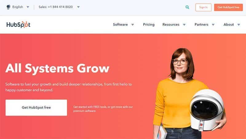
Typically, I recommend a clear Call to Action with a big ass button that says what you want the user to do along with a clear Value Proposition and quick subheading to give some detail. Here’s a great example from HubSpot.
The High Converting Call to Action (CTA)
Before you begin to draft the design of your landing page, determine what you want visitors to your site to do. Depending on your online marketing goals, you need to create expectations and a method for measuring results. Are you trying to increase newsletter subscribers? Do you want them to test-run your service with a free trial?
Speaking of methods for measuring results on your website this is imperative for you to get setup with NOW. I’ve worked with far too many website redesigns that have no Analytics and no Tracking. At a bare minimum you need Google Analytics, Facebook Pixel, LinkedIn Insight Tag, and Google Search Console. If you need or want help setting these up reach out to us.
Your actual call to action should be directly tied to your goals.
It may seem obvious, but some businesses forget to ask for what it is they want. If you want someone to download a program you offer, having a download button is necessary to a successful landing page. Keep it simple but let people know exactly what they are downloading, subscribing to, etc.
This discussion of goals being tied to design is very important. It means that your business needs to be clear about where it’s going, how it wants to go there, who it is targeting and how to best do that BEFORE designing. A discovery session or a call with a consultant can help clarify this so you aren’t constantly requesting website and design changes unnecessarily. A qualified landing page design agency can take your site to the next level and protect your asset.
A call to action by itself isn’t enough if people don’t know what they are getting from entering their information. You should usually only ask for the vitals; otherwise, too many fields may scare off potential conversions. Vitals might include only an email address or name at the top of your funnel. However, to qualify leads and when quoting it is often better to add requests such as budget, phone # etc. This can impact your conversion rate tremendously and save your sales force time and money.
Landing Page Design and Your Content
“Clear, concise and persuasive” should be your mantra for landing pages. Provide enough information so that people who have never heard of your company, or are unsure of what you offer, can get a handle on just how much your product will benefit them. This is where the Value Proposition I mentioned in the opening fits in and really helps your landing page shine.
How long should the Value Proposition be? It depends. While a single sentence or two may work for some; it doesn’t work for all. You want to provide enough interesting information to warm up visitors and encourage them to continue in the direction you want, following the CTA. Always have at least one picture for eye-catching appeal. If possible, have a below the fold video. I don’t recommend video or sliders on landing pages as they slow load times and just mess up the user experience. However, a well done and professional video can work, but this isn’t something a DIY web design can pull off in my opinion. You really need a custom designer working on this.
[adToAppearHere]
However, if you just don’t see yourself as a web designer that’s ok too. We can provide you with help and many of the website builders are great at helping a newbie design site. One popular builder is Beaver Builder and iThemes has designed a course just for those looking to build there own website with the builder.
Design that Works: Landing Page 101
Design is very important when it comes to landing pages. Too much noise in the way of images, wording and such in the design can feel overwhelming and unclear. However, a page without enough elements can bore visitors. Keep your landing pages consistent with the design of the email or PPC marketing campaigns that led the visitor there; this includes fonts and colors. Studies have shown that single, centered-column landing page is the most effective, but you can test out other layouts to match your marketing campaigns.
Keep in mind where the page fold occurs. Have your call to action clearly stated and above the line. Of course, you don’t want to lose people who scroll down so scattering your calls to action is beneficial as well.
Provide the essential information above the fold, and if you need a longer page, include additional information below the fold. Making sure your call to action is a flattering, color contrast to the rest of the page is a great way to draw attention to that section of the page.
Conclusion
Simple, well-designed landing pages can increase your conversions from marketing campaigns but remember that testing is the key. I believe that businesses should be A/B Testing landing pages and the source of these landing pages regularly. Be consistent with the design that has led people to the page and make the call to action clear.
High converting landing pages are about extending marketing campaigns, and in order to have a successful conversion rate, these pages should provide just enough interesting and informational content to show the visitor just how this product/service can benefit them. Pay attention to your CTA, content, and design to improve your landing pages and boost conversions.